html5 grid framework similar to bootstrap.
The Amazon Effect and How Retailers Can Slay the Beast
9 June 2017 @ 7:00 pm
 The past year has been brutal for retailers, with many respected brands closing stores or shutting down completely. Traditional retailers like Sears, Kmart, JCPenny and Macy’s are struggling to find footing and losing customers. It’s not as if this wasn’t expected- Amazon has been disrupting the world of retail the last twenty years by driving online shopping growth and creating record breaking revenue. People call it The Amazon Effect.
But is this Amazon Effect real? Or is it just the natural turnover of poorly performing companies? According to the Census Bureau, retail spending as a whole is up 5% year over year, and up 17% in the last five years. The ACSI also says there is a rise in how people feel about ret
The past year has been brutal for retailers, with many respected brands closing stores or shutting down completely. Traditional retailers like Sears, Kmart, JCPenny and Macy’s are struggling to find footing and losing customers. It’s not as if this wasn’t expected- Amazon has been disrupting the world of retail the last twenty years by driving online shopping growth and creating record breaking revenue. People call it The Amazon Effect.
But is this Amazon Effect real? Or is it just the natural turnover of poorly performing companies? According to the Census Bureau, retail spending as a whole is up 5% year over year, and up 17% in the last five years. The ACSI also says there is a rise in how people feel about retHow Design Insights Transformed Foundation Building Blocks
26 May 2017 @ 9:00 pm
 Foundation started out as an internal tool to help our team build cutting edge applications for our clients more quickly. Little did we know, it would blow up to be one of the most popular open source projects ever, accelerate the adoption of responsive web design, and power hundreds of thousands of brands all across the world. We're proud that Foundation has become a leading voice helping shape where the web is heading. However, through our constant conversations with students, the community, and
 The New Foundation Docs: Learn Your Way
17 May 2017 @ 7:00 pm
 Whether for internal use or for an open-source project, most programmers hate writing technical documentation. Not just dislike, hate. They hate it. And because they hate it, it usually isn't very good. It can be hard to follow and incomplete, which is irritating to experienced devs and causes panic attacks for newbies just trying to learn something. RTFM, or Read the F@$%& Manual, is an expression commonly thrown at people trying to learn some new coding language or technology, but how can they if nobody wants to WriteTFM?
But even if a developer or team wants to create good documentation, it will inevitably fall short because not everyone learns best through reading. Many people are visual learners, and even more learn best through the act of doing.
Whether for internal use or for an open-source project, most programmers hate writing technical documentation. Not just dislike, hate. They hate it. And because they hate it, it usually isn't very good. It can be hard to follow and incomplete, which is irritating to experienced devs and causes panic attacks for newbies just trying to learn something. RTFM, or Read the F@$%& Manual, is an expression commonly thrown at people trying to learn some new coding language or technology, but how can they if nobody wants to WriteTFM?
But even if a developer or team wants to create good documentation, it will inevitably fall short because not everyone learns best through reading. Many people are visual learners, and even more learn best through the act of doing.Foundation Building Blocks: Over 100 Components to Jump Start Your Projects
13 April 2017 @ 5:00 pm
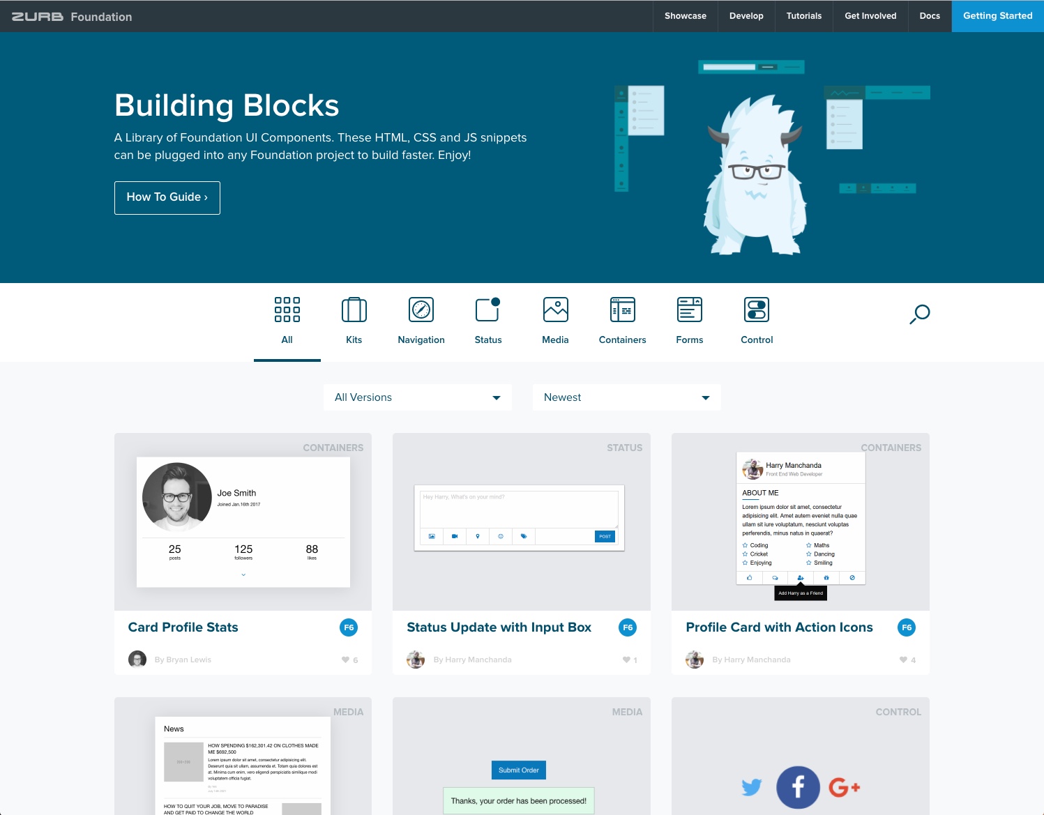
The Foundation team has cut your development time in half again. Today we're thrilled to share Foundation Building Blocks with you- a comprehensive, open-source library of coded UI components you can drop into any standard Foundation project to give yourself a massive head start in your projects.
Hundreds of Coded UI Components for Your Foundation Projects
 The Foundation Building Blocks library has been rebuilt from the ground up with over 100 code snippets in six categories including Navigation, Status, Control, Media, Containers and Form components. Built by the ZURB team, these are the most common and useful design patterns and UI components we've found in our two decades of web development work. Just browse the library, select the Building Block you need, and copy and paste the code into your pr
 The Foundation Building Blocks library has been rebuilt from the ground up with over 100 code snippets in six categories including Navigation, Status, Control, Media, Containers and Form components. Built by the ZURB team, these are the most common and useful design patterns and UI components we've found in our two decades of web development work. Just browse the library, select the Building Block you need, and copy and paste the code into your pr
Foundation & CSS Grid: Think Beyond the Page
13 March 2017 @ 11:55 pm
There's a revolution happening right now. The way we think about and design websites is going to change again. Old conventions and methods are being replaced by exciting new technologies that open up entirely new ways to design and build the web. And they're available today.
Out With the Old
Most early websites in the 90’s were little more than digital brochures, which makes sense since the web was born from the world of print. Our options as web designers for laying out content fell short of what was available to print designers for many years. Slowly but surely, our tools got better and we discovered new methods and techniques that allowed us to do some incredible things. The web came into its own, but the world of print still exerts its influence on the way many designers think. To this day we still call web files “documents,” arrange our content in “pages,” and try to fit the experience of users into sitemaps.
17 Web Design Trends That Will Take Over 2017
10 March 2017 @ 8:00 pm
Designers working on web projects in 2017, in some ways, face more challenges than ever before. They have to create engaging websites, apps, and services that work seamlessly across all devices and work for a global audience at a pace that seems to speed up every year. That audience too is more tech savvy, have higher expectations and are more design literate than ever before and expect near perfection. Faced with these challenges, it's more important than ever for designers to be aware of emerging trends, solutions and patterns that can help them solve common issues, capture the full attention of their audiences, and deliver amazing experiences.
Here at ZURB, we've helped hundreds of companies surface the best solutions and take advantage of new patterns in their websites and products. We've created this list of 17 design and development trends we think every designer should be
What's Underneath Matters: How MeUndies Increased Mobile Conversion by 40%
2 March 2017 @ 5:01 pm
 Did you know that most men own at least one pair of underwear that's over 7 years old? We didn't' and we sort of wish that realization stayed hidden from us, to be honest. MeUndies, a company leading the movement in underwear innovation by providing comfortable everyday basics and a transparent shopping experience, gave us this fact. They recently started using Foundation on their site in an effort to boost their mobile sales, which constitutes most of their traffic and we wanted to share their story.
After 7 years, it was time for MeUndies to change their site's underwear, which is to say their code. See, the MeUndies site was beginning to boom on mobile, but they were losing sales by not optimizing the experience and ease of use for those mobile users. The team began to put their heads together and started exploring solutions.
Did you know that most men own at least one pair of underwear that's over 7 years old? We didn't' and we sort of wish that realization stayed hidden from us, to be honest. MeUndies, a company leading the movement in underwear innovation by providing comfortable everyday basics and a transparent shopping experience, gave us this fact. They recently started using Foundation on their site in an effort to boost their mobile sales, which constitutes most of their traffic and we wanted to share their story.
After 7 years, it was time for MeUndies to change their site's underwear, which is to say their code. See, the MeUndies site was beginning to boom on mobile, but they were losing sales by not optimizing the experience and ease of use for those mobile users. The team began to put their heads together and started exploring solutions.Design for Proximity, Not for Clicks
17 January 2017 @ 7:00 pm
Remember when the web was a collection of static websites, largely HTML, no CSS, and layout done with tables and frames? How about even farther back ' when your choice of mediums for design were print, film, industrial, and maybe even radio?
What about the aforementioned mediums is consistent? They were all linear. That meant we could think about things going from A-Z and stop there. Even when we got digital interfaces (enter HTML), we continued to think of interfaces as static screens for decades. It made things simple, and we put our focus into cutting the amounts of clicks on that trail to get people to the end faster. The data even seemed to prove it, with more clicks equaling 'bad' and less clicks equaling 'good.' This especially seemed to ring true in the eCommerce world where it's been accepted that the more hoops you make your user go through to buy something, the less sales you'll see. It was estimated that
Bring Your Page to Life with Reactive Animations
12 January 2017 @ 6:30 pm
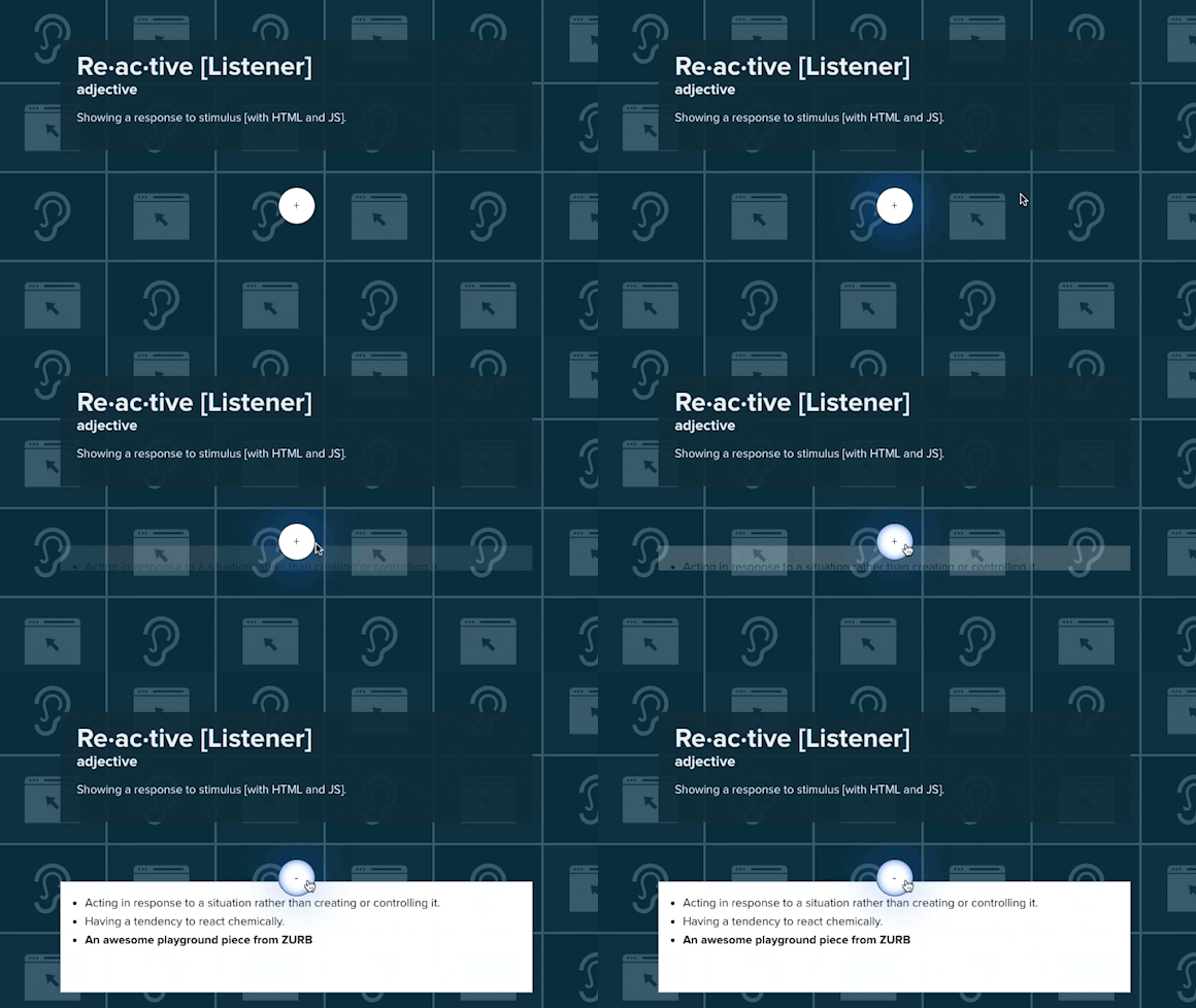
 The explosion of native mobile apps this decade put a spotlight on human centered design. Apple's iPhone and iOS were breakthroughs in part because of the way they used design to mimic humans and appeal to emotion. How good a design looks now plays second fiddle to the way it feels. New terms like 'microinteractions' and 'reactive animations' have been thrust into the designer's vernacular. It's a new era of design, the 'Experience Era.'
While mobile has been killin' it in this area, desktop experiences have still felt cl
The explosion of native mobile apps this decade put a spotlight on human centered design. Apple's iPhone and iOS were breakthroughs in part because of the way they used design to mimic humans and appeal to emotion. How good a design looks now plays second fiddle to the way it feels. New terms like 'microinteractions' and 'reactive animations' have been thrust into the designer's vernacular. It's a new era of design, the 'Experience Era.'
While mobile has been killin' it in this area, desktop experiences have still felt clDesign or Get Off the Pot
27 December 2016 @ 8:31 pm
 Designers, it's time to elevate our game or get off the pot. Yes, I'm telling designers to step up. Because I'm not seeing it happen. What I see now are scared designers afraid to make decisions on behalf of their organizations. Creators and craftsmen struggling to tell other people what works best, and it's putting their own future along with their organization's in jeopardy.
Everyone wants the benefits that come along with authority and influence, but most don't want what inevitably follows: the responsibility of decision making. Making decisions all day requires tremendous amounts of mental energy. Sometimes it's not fun and it can be scary. These feelings, combined with impostor syndrome, put doubt into the heads of